

Key Takeaways
Scale and Proportion
Scale refers to the size of an object relative to the room or space it occupies. Proportion describes the size relationship between objects relative to each other. Together, they determine whether a room feels balanced, cramped, or visually chaotic. When scale and proportion are right, a room simply feels comfortable - even if you can't explain why.
In classical design theory, proportion is often tied to mathematical ratios such as the golden ratio (approximately 1:1.618), though in everyday decorating, visual judgment and a few practical rules of thumb are more useful guides.
Why These Two Concepts Get Confused
Most people use the words scale and proportion interchangeably, but they describe two distinct relationships. Understanding the difference makes it much easier to diagnose why a room doesn't feel right - and to fix it.
Scale is about a single object's size in relation to the room around it. A seven-foot wardrobe in a room with eight-foot ceilings is a scale problem. Proportion is about the size relationship between objects. A massive sectional sofa paired with a delicate side table the size of a dinner plate is a proportion problem.
Both matter, and both can work against you even when you've spent a lot of time (or money) on a room. The good news is that once you can see the difference, you start to notice these issues quickly - and most can be corrected without replacing major furniture. For a broader look at the vocabulary designers use, the plain-language decorating glossary is a useful companion reference.
How Scale Works in a Real Room
Think of scale as the conversation between one item and the room itself. A loveseat in a large, open-plan living room will look undersized - not because anything is wrong with the loveseat, but because the room dwarfs it. That's a scale mismatch.
The most common scale mistake homeowners make is actually going too small, not too large. Worried about overwhelming a room, people often choose petite furniture, then wonder why the space feels empty or cluttered with filler accessories. A single well-scaled sofa anchors a living room far better than three small pieces fighting for presence.
2/3
Ideal artwork width relative to sofa length
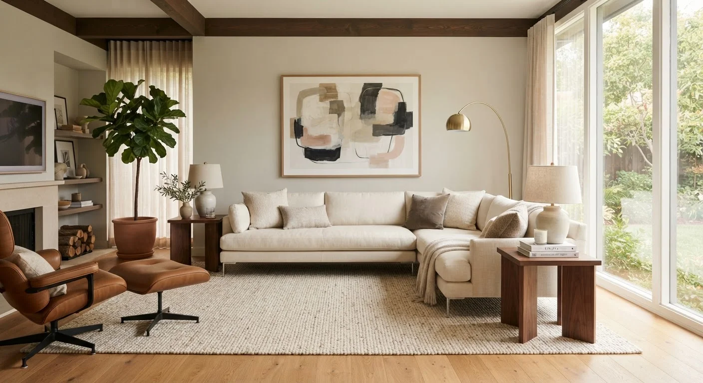
Interior design educators commonly cite the two-thirds rule as a reliable starting point for sizing wall art above a sofa or console table.
57-60"
Recommended center height for hanging artwork
This range corresponds to average adult eye level when standing and is a widely used standard in both residential and gallery settings.
8x10 or larger
Minimum rug size recommended for most living rooms
Interior designers frequently note that undersized rugs are among the most common and easily corrected scale mistakes in residential spaces.
Practical ways to test scale before you commit:
- Use painter's tape on the floor to mark a furniture footprint before buying.
- Cut paper templates to size and place them where pieces would sit.
- Photograph the room and overlay furniture dimensions digitally using free room-planning tools.
How Proportion Works Between Objects
If scale is the object-to-room relationship, proportion is the object-to-object relationship. A dining table and its chairs, a sofa and its coffee table, a bed and its nightstands - all of these pairs (and groups) need to relate in size in a way that feels visually coherent.
Some practical proportion benchmarks that hold up well in real spaces:
- Coffee table to sofa: The table should be roughly two-thirds the length of the sofa and sit within a few inches of the seat height.
- Artwork above a sofa: The piece (or grouping) should span about two-thirds to three-quarters of the sofa's width.
- Nightstands to bed: Nightstand height should roughly align with the top of the mattress, not sit far below or above it.
These aren't rigid laws, but they reflect the kind of visual balance that makes a room read as intentional. Proportion also applies to decorative groupings - varying heights and sizes within a vignette prevents it from looking flat. The rule of three in decorating is a simple way to apply proportional thinking to shelf styling and tabletop arrangements.
Test Proportion Before You Hang or Buy
Before committing to artwork placement or a new furniture piece, mock it up first. Cut a piece of kraft paper or newspaper to the exact dimensions of the item and tape it to the wall or lay it on the floor. Living with the template for a day or two gives you a much clearer sense of whether the size works in context - and it costs nothing.
Common Mistakes and How to Correct Them
Several proportion and scale errors show up repeatedly in home decorating, regardless of budget or room size:
- Rugs that are too small
- A rug that only fits under the coffee table leaves seating pieces floating on bare floor. Size up so that at least the front legs of sofas and chairs sit on the rug.
- Artwork hung too high
- Artwork tends to drift upward when people hang it. Center pieces at roughly eye level (57-60 inches from the floor) and keep artwork within 6-8 inches above any furniture it relates to.
- Lamps that disappear
- Table lamp shades that sit well below eye level when you're seated don't light the room effectively and look visually lost. The bottom of the shade should generally align near eye level when seated.
- Matching-set furniture
- Buying a complete matching suite eliminates proportion decisions - but it also flattens a room. Mixing pieces of varied size and weight looks more intentional.
Many of these assumptions are reinforced by decorating myths worth examining directly. The common decorating myths article addresses several widely repeated ideas that actually work against a room's sense of space.