

| Vignette origin | From the French word for 'little vine' - originally a small decorative design in printing |
| Rule of three | Objects grouped in odd numbers (especially threes) are widely considered more visually pleasing than even groupings |
| Visual weight factors | Color, size, texture, pattern, and placement all affect how heavy or light an object appears |
| Negative space role | Empty areas in a room are intentional design elements, not decorating failures |
| Focal point placement | Every room benefits from one dominant anchor - the eye needs somewhere to land first |
| Rhythm repetition minimum | Repeat a color, shape, or material at least three times across a room to establish rhythm |
Why Decorating Jargon Matters
Interior decorating has its own language - and if you've ever felt lost reading a design article or watching a home makeover show, you're not alone. Terms like vignette, juxtaposition, and visual weight get thrown around as if everyone already knows what they mean. This reference breaks them down in plain English, so you can apply them with confidence whether you're renting, redecorating, or starting from scratch as a new homeowner.
You don't need a design degree to create a room that looks and feels right. What you do need is a shared vocabulary - one that helps you understand why something works or doesn't, so you can make intentional choices rather than guessing.
Vignette
A small, intentional grouping of objects arranged to create a cohesive, story-like display - commonly on a shelf, tray, or tabletop. A well-composed vignette typically includes varied heights, textures, and a mix of functional and decorative items.
Visual weight
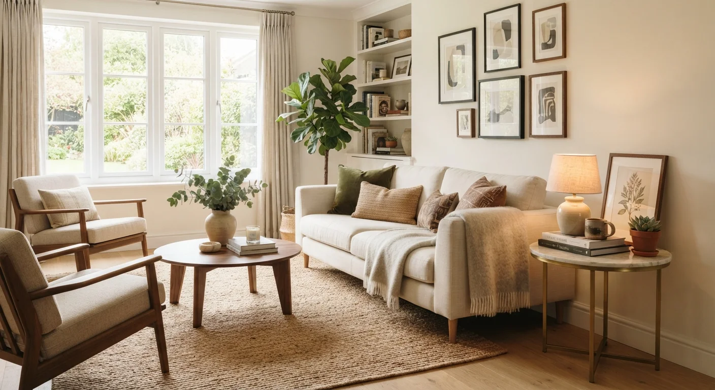
The sense of heaviness or lightness a piece carries based on its size, color, texture, and pattern - not its actual mass. A dark, ornate cabinet has more visual weight than a light-colored, minimal one of the same dimensions.
Juxtaposition
The deliberate placement of contrasting elements side by side - such as rough and smooth, old and new, or matte and glossy - to create visual interest and highlight the unique qualities of each piece.
Negative space
The intentionally empty areas in a room or on a surface. Negative space gives the eye a place to rest and allows featured objects to stand out rather than compete with surrounding clutter.
Rhythm
The repetition of a color, shape, or material across a room to create a sense of flow and visual continuity. Rhythm helps a space feel cohesive without requiring everything to match exactly.
Focal point
The dominant visual anchor of a room - the element your eye moves to first when you enter. Common focal points include fireplaces, large windows, statement art pieces, or a prominent piece of furniture.
Color temperature
A description of whether a color reads as warm (reds, oranges, yellows) or cool (blues, greens, violets). Color temperature affects the mood of a room and how natural and artificial light interact with wall and fabric colors.
Layering
The practice of adding depth and dimension to a room by combining multiple elements - textiles, lighting levels, decorative objects - rather than relying on a single statement piece. Layering creates rooms that feel rich and livable rather than flat.
Key Concepts at a Glance
The following quick-reference card captures how these terms tend to show up in practice - from how designers describe spatial relationships to the language used when mixing furniture styles.
| Vignette origin | From the French word for 'little vine' - originally a small decorative design in printing |
| Rule of three | Objects grouped in odd numbers (especially threes) are widely considered more visually pleasing than even groupings |
| Visual weight factors | Color, size, texture, pattern, and placement all affect how heavy or light an object appears |
| Negative space role | Empty areas in a room are intentional design elements, not decorating failures |
| Focal point placement | Every room benefits from one dominant anchor - the eye needs somewhere to land first |
| Rhythm repetition minimum | Repeat a color, shape, or material at least three times across a room to establish rhythm |
Once you understand the building blocks, you can start applying them room by room. For example, visual weight is one of the most practical concepts to grasp early - it explains why a room can feel lopsided even when the furniture is technically centered. A dark, heavy-looking sofa on one side of a room without a visual counterbalance (perhaps a tall bookshelf, a large mirror, or a cluster of artwork) will feel off even if you can't immediately explain why.
Similarly, understanding scale and proportion - the relationship between object sizes and the room they occupy - can prevent common decorating mistakes. Our related guide on what scale and proportion mean in interior decorating goes deeper on this topic if you want to explore it further.
Putting the Terms to Work
Knowing a term is useful; knowing how to act on it is better. Here's how several of these concepts translate into everyday decorating decisions:
- Vignette: Group three to five objects of varying heights on a tray, shelf, or tabletop. Include something natural (a plant or stone), something functional (a candle or book), and something personal (a small sculpture or framed photo). The grouping tells a small story.
- Juxtaposition: Pair something rough with something smooth - a raw-wood side table next to a velvet chair, or a concrete lamp base with a linen shade. Contrast creates visual interest and prevents a room from feeling too matchy.
- Negative space: Resist filling every surface and wall. Empty areas give the eye a place to rest and make the pieces you do display feel more intentional. This is especially useful in smaller rooms.
- Rhythm: Repeat a color, shape, or material in at least three places across a room. A terracotta tone in a pillow, a ceramic pot, and a piece of artwork creates visual rhythm that ties a space together without matching everything exactly.
These principles work just as well in a rented apartment as they do in an owned home. If you're working around restrictions, see our ideas for rental-friendly ways to add personality to any room. And if you're adding softness and depth through fabric, layering textiles is one of the most effective - and budget-friendly - techniques available to any homeowner.