

Key Takeaways
Why the Matched-Set Instinct Works Against You
Walk into almost any furniture showroom and you'll see the same thing: sofas, armchairs, coffee tables, and side tables arranged in perfect coordinated suites. It looks appealing in a curated retail space, partly because the lighting is optimized and the surroundings are neutral. Bring that same matched set into a real home, and something gets lost.
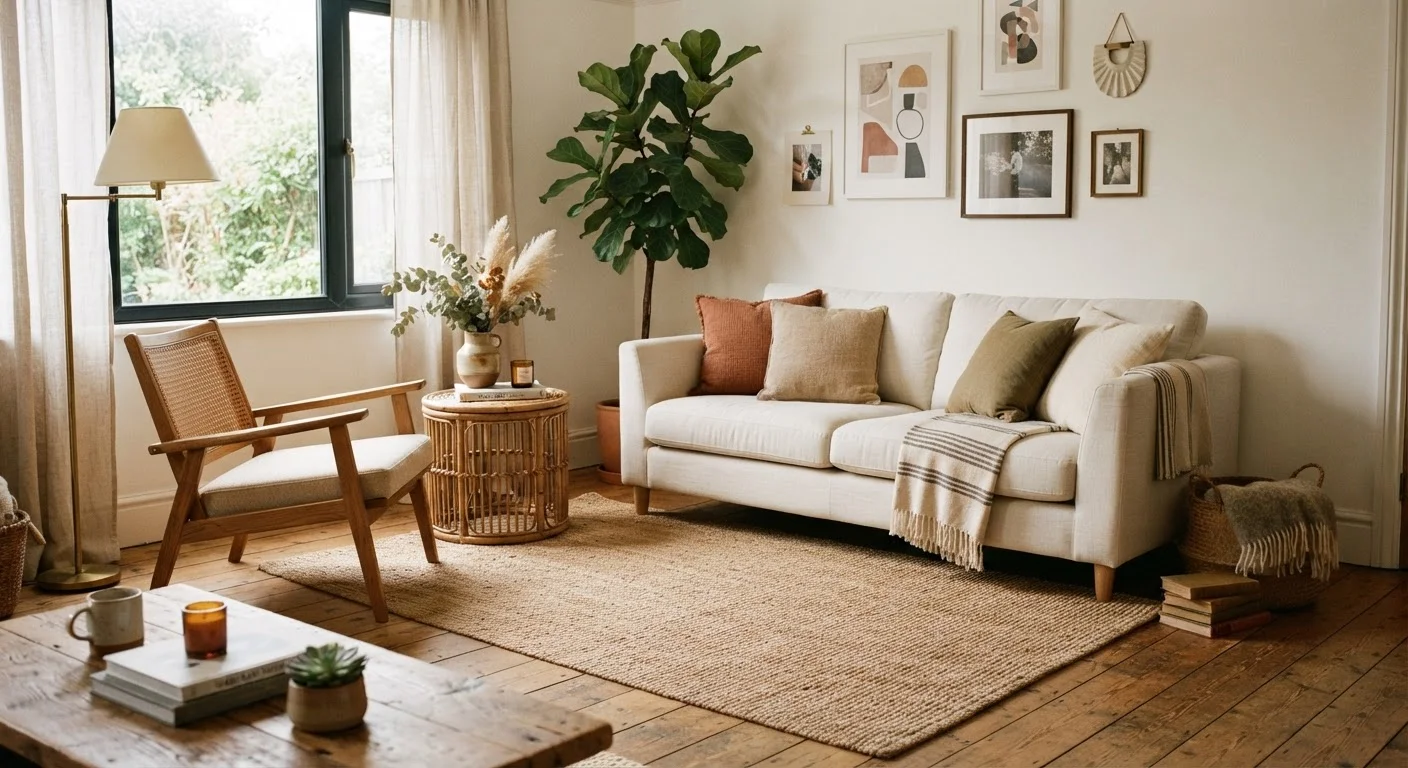
The problem is predictability. When every piece in a room shares the same finish, fabric, and proportions, the eye has nothing to travel toward. Contrast - in color, texture, scale, and material - is what creates visual interest. Without it, a room reads as flat, even if the individual pieces are attractive. It can also feel impersonal, more like a hotel lobby than a lived-in home.
This isn't about avoiding coordination. It's about recognizing that cohesion comes from a shared palette and design language, not from identical product lines. Several widely repeated decorating rules actually work against homeowners in similar ways - making rooms feel constrained rather than considered.
Cohesion Is Not the Same as Matching
Many homeowners conflate coordinated rooms with matched rooms. A room can feel beautifully pulled-together without a single matching pair. What unifies a space is a consistent color palette, scale relationships, and shared design language - not identical finishes from the same product line.
The Most Common Matching Mistakes - and How to Fix Them
Most flat-looking rooms share a handful of predictable patterns. Recognizing them is the first step toward correcting them, often without replacing major pieces.
Buying a complete furniture suite because it feels like the 'safe' choice.
Why it happens: Matched sets are heavily marketed as foolproof solutions, and selecting individual pieces feels intimidating without design training.
Matching all wood tones in a room to a single finish.
Why it happens: The instinct to 'match' extends to finishes - homeowners assume mismatched wood tones will clash, so they over-coordinate.
Ignoring texture variation when all furniture shares the same material.
Why it happens: When selecting a suite, every piece is upholstered or finished the same way, which flattens surfaces visually even when colors are pleasant.
Scaling all furniture to the same height and visual weight.
Why it happens: Sets are designed to match in proportion, which eliminates the highs and lows that give a room rhythm and visual movement.
Applying a single dominant color with no tonal variation or contrast.
Why it happens: Homeowners choose a color they love and commit to it throughout, assuming consistency equals harmony.
Before making any significant changes, it's worth reviewing the fundamentals. Check traffic flow, focal points, and lighting before moving anything - rearranging without a plan can introduce new problems.
Building a Room That Looks Intentional, Not Accidental
The goal of mixing pieces isn't randomness - it's creating a room that appears to have been collected over time, with genuine thought behind each addition. A few structural principles make this reliable rather than risky.
Anchor, then vary. Choose one dominant piece - usually the largest upholstered item - and treat it as fixed. Every subsequent choice should either complement or gently contrast with it. This gives you creative range without losing a reference point.
Use odd numbers. Groupings of three, five, or seven objects on a shelf or tabletop feel more dynamic than pairs or symmetrical arrangements. The rule of three is a reliable tool for organizing objects without making them feel stiff.
Let flooring unify. A consistent floor surface ties mismatched furniture together more effectively than most people expect. If your floors vary, a single area rug under a seating arrangement creates the same anchoring effect. See how different flooring materials interact with furniture choices.
Mixing Without a Plan Can Backfire
Replacing matched pieces randomly, without considering undertones or scale, can tip a room from 'flat' into 'chaotic.' Before swapping anything out, identify the palette anchor - usually your largest upholstered piece - and build decisions around it. A room benefits from contrast, but contrast needs a unifying thread to read as intentional.
Applied carefully, these principles work in any room size. Small living rooms especially benefit from intentional mixing, since heavy matched suites tend to dominate compact spaces without offering the visual relief that contrast provides.
60-30-10
Classic interior color distribution rule
Interior designers commonly recommend distributing room color as 60% dominant, 30% secondary, and 10% accent to achieve visual balance without monotony.
3+
Texture types recommended per seating zone
Design educators generally advise introducing at least three distinct texture types within a single furniture arrangement to prevent visual flatness.