

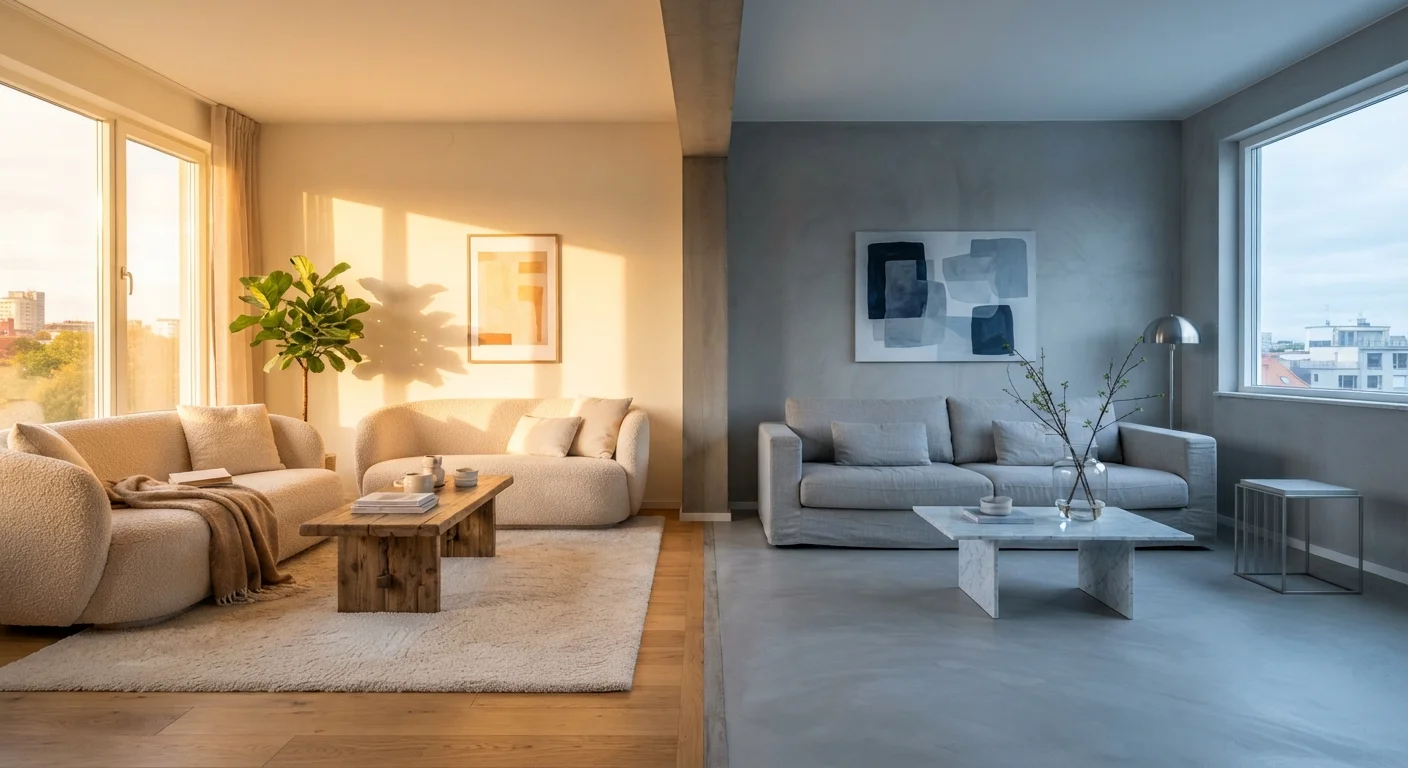
Key Takeaways
Option A
Warm-Toned Neutrals
The inviting, grounding choice for cosy, lived-in spaces.
Best for: Rooms with limited natural light, north-facing exposures, or spaces where you want a comfortable and intimate atmosphere.
Option B
Cool-Toned Neutrals
The crisp, airy option that makes spaces feel open and modern.
Best for: Bright south- or west-facing rooms, contemporary interiors, and spaces where you want a clean, expansive feel.
If your room faces north and feels dim or cold
Warm-Toned Neutrals
Warm undertones counteract the blue cast of north-facing light, making the room feel inviting rather than dreary.
If you have a sunny south- or west-facing room
Cool-Toned Neutrals
Bright natural light can make warm neutrals feel overly yellow or orange; cool tones stay balanced and sophisticated.
If your floors and furniture lean toward honey oak, walnut, or warm wood tones
Warm-Toned Neutrals
Matching warm to warm creates visual harmony; cool neutrals on warm wood can produce an unintentional clash.
If you have a contemporary interior with white trim and cool-toned metal fixtures
Cool-Toned Neutrals
Cool wall colours align with crisp white woodwork and brushed nickel or chrome details for a cohesive, modern look.
If you want one neutral to work across open-plan connected spaces
Warm-Toned Neutrals
Warm neutrals read consistently across varied lighting conditions within a large open-plan area, reducing visual fragmentation.
What Makes a Neutral 'Warm' or 'Cool'?
At first glance, beige is just beige. But step back and compare two beige paint chips side by side and you'll often notice one looks slightly peachy or golden, while the other reads almost greenish or grey. That difference comes down to undertones - the secondary hue hiding beneath the dominant neutral colour.
Warm-toned neutrals carry undertones of yellow, red, orange, or brown. Think classic creamy beige, sandy taupe, and the popular greige (a blend of grey and beige) with a caramel lean. Cool-toned neutrals, by contrast, pull toward blue, green, violet, or true grey. A greige can land in either camp depending on whether it leans taupe (warm) or sage (cool).
Understanding undertones matters because your eyes naturally perceive the relationship between a wall colour and the light hitting it. Artificial incandescent lighting tends to amplify warm undertones, while LED daylight bulbs and natural north-facing light can bring out cool casts you didn't notice on the paint chip. This is why understanding your room's light source is a critical first step before choosing any neutral palette.
| Criterion | Warm-Toned Neutrals | Cool-Toned Neutrals |
|---|---|---|
| Common examples | Creamy beige, taupe, warm greige | True grey, blue-white, sage greige |
| Underlying hues | Yellow, red, orange, brown | Blue, green, violet, true grey |
| Mood created | Cosy, intimate, grounding | Crisp, airy, spacious |
| Best room orientation | North- or east-facing (low/cool light) | South- or west-facing (bright/warm light) |
| Pairs well with | Warm woods, leather, aged brass | Cool ash floors, chrome, white trim |
| Risk if misapplied | Can feel yellowed or dated in bright light | Can feel cold or clinical in dim rooms |
| Works in open-plan spaces | Highly consistent across varied light zones | May shift noticeably between light zones |
How Each Tone Affects Mood and Perceived Space
Warm neutrals create a sense of enclosure and comfort - they draw walls in slightly and give a room a cradled, intimate feel. This makes them excellent in living rooms designed for relaxing evenings, dining rooms meant to feel convivial, and bedrooms where you want to feel cocooned rather than exposed.
Cool neutrals do the opposite: they visually recede, making walls feel further away and ceilings higher. In a small or cluttered space, a cool grey or blue-white can lend an airiness that helps the room breathe. That said, in a poorly lit room, cool neutrals can tip into feeling stark or even gloomy if there isn't enough natural or artificial warmth to balance them. See our guide to small living room principles for how colour interacts with layout and scale.
Neither approach is inherently superior - the right choice depends almost entirely on the conditions of your specific room.
~60%
Influence of wall colour on perceived room temperature
Interior design research consistently finds that colour choice is among the top factors influencing how warm or cool a space feels to occupants, independent of actual room temperature.
North-facing
Room orientation most affected by undertone choice
North-facing rooms receive indirect, blue-toned daylight throughout the day, making them particularly sensitive to cool undertones that can amplify a room's coldness.
Matching Neutrals to Your Existing Furniture and Flooring
One of the most common decorating mistakes is choosing a wall colour in isolation. Your neutral needs to coordinate with everything already anchored in the room - primarily your flooring and largest furniture pieces.
If your floors are warm-toned hardwood (honey oak, cherry, or golden pine), a warm neutral on the walls creates a harmonious envelope that feels intentional. Pair those same floors with a stark cool grey, however, and the contrast can feel jarring rather than modern. Conversely, if your flooring is a cool pale ash or concrete-look tile, cool-toned walls will feel cohesive, while a very warm beige risks making the space feel muddy.
The same logic applies to upholstery. A charcoal linen sofa leans cool and works naturally against grey or greige walls. A caramel leather couch asks for warm company - creamy off-whites, warm taupes, or even a deep warm greige. For tips on how furniture combinations interact with your palette, consider mixing furniture pieces effectively rather than relying on matched sets. Your flooring material itself also carries undertones worth checking - our flooring comparison guide can help you read those cues.
Testing Before You Commit
No online swatch or phone photo will tell you how a paint colour will look in your specific room. The only reliable method is to apply a large physical sample - at least 12 inches by 12 inches - directly onto your wall and observe it at different times of day and under your actual artificial lighting.
When evaluating samples, look at them against your trim colour, your flooring, and your main furniture. Check them in morning light, at midday, and in the evening with lamps on. A colour that looks like a clean warm white at noon may turn distinctly yellow by lamplight. A sophisticated cool grey in daylight can appear lavender under incandescent bulbs.
Also consider how a neutral will interact with textiles you layer into the room. Cushions, throws, rugs, and curtains all carry their own undertones, and learning to layer textiles for depth depends on having a base wall colour that cooperates rather than fights with your fabric choices. If you're weighing whether a single neutral wall or all four walls is the right approach, comparing accent walls to full-room colour may help clarify your next step.